


Every year, Pantone sets the trend for colors in print design, marketing and advertising, interior design and many other industries when they announce their Color of the Year. The 2018 Color of the year is Ultra Violet 18-3838.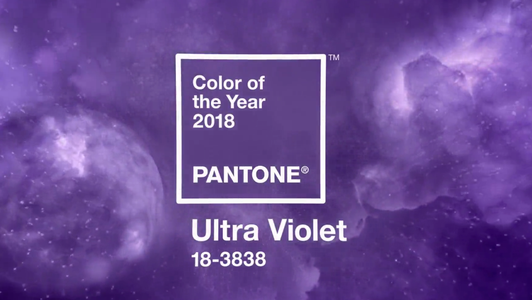
“A dramatically provocative and thoughtful purple shade, Ultra Violet 18-3838 communicates originality, ingenuity and visionary thinking that points us toward the future. Complex and contemplative, Ultra Violet suggests the mysteries of the cosmos, the intrigue of what lies ahead, and the discoveries beyond where we are now. The vast and limitless night sky is symbolic of what is possible and continues to inspire the desire to pursue a world beyond our own.”
Pantone “is the world-renowned authority on color.” They provide color systems for various industries and are most known for their Pantone Matching System (PMS) which, significant to the promotional products industry, is a way of standardizing colors. Advertisers use Pantone colors on a regular basis when imprinting custom items with logos and marketing messages. PMS matching is important to corporations who have specific colors as part of their corporate identity.
What do you think about the Pantone color for 2018? Will you use Ultra Violet in your design or advertising this year?